Brompton

An identity for the No.1
Hard Seltzer in Europe.

The Challenge

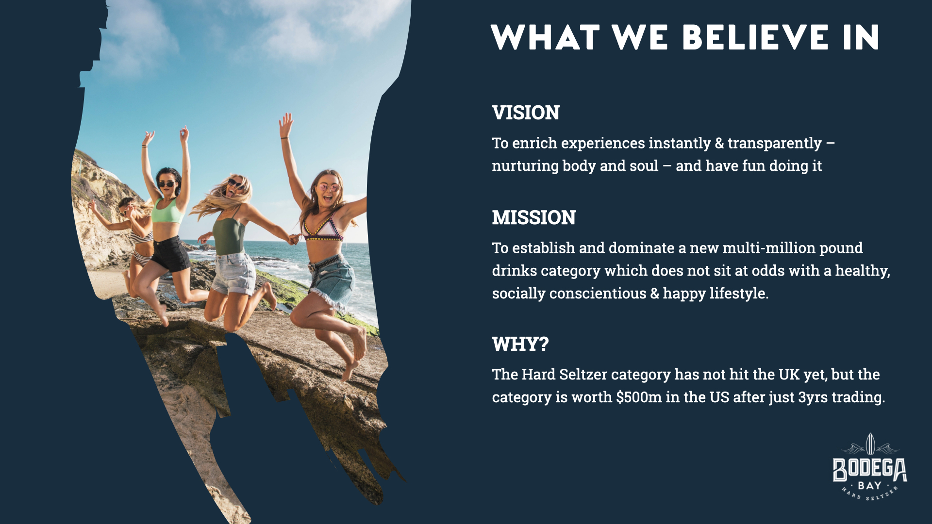
Our client spotted an opportunity to bring the latest US drink trend (Hard Seltzer) to the UK. Taking influence and advice from the industry leaders in the US Nation & James had the challenge of creating a brand that would resonate with a European audience, tempt them away from other categories and convert to hard seltzer.

Services
Brand Strategy
Brand Name
Brand Identity
Brand Guidelines
Packaging
Web Design
Social Marketing Assets
A brand for healthy hedonists.

The client had various contacts in the marketing and PR sector of the drinks industry and had been nurturing the ambition to set out with a project of their own when they felt the time was right.

Cue a trip to California and a bit of time spent immersed in the west coast surf scene. A drink called Hard Seltzer seemed to be everywhere and it spoke to a fun filled but low calorie active lifestyle.

Our audience would be party people with a conscientious core. The aesthetic should project the qualities of the drink, so we kept it light and clean.

Creating the UK's first Hard Seltzer Brand.

Working closely with Bodega Bay and partner agencies from product conception to market, we were briefed to create the brand identity and immerse ourselves in the category supporting the development of a new brand completely from scratch.

Launching for the European marketplace as a priority, we lead the naming convention and brand ID for Bodega Bay, which is now Europe's number one hard seltzer. We were dedicated to arrive at an identity for the brand that was rooted in this origin story, a nod to the laid back and breezy West coast culture.

Taking inspiration from California's surf culture - we designed and crafted a bespoke logo with a unique and fully custom wordmark. The relatively fast rollout of this new brand meant Bodega Bay could capitalise on being the first Hard Seltzer in the UK and a leading alcoholic sparkling water in Europe.

Inspiring a generation to drink differently.

After creating a high quality, low calorie product we had to design packaging fit for purpose.

We opted to create something minimal, yet bold - that would stand out from the current products on the shelves. Encapsulating the brand's ethos for balance and responsible drinking, whilst maintaining exciting and youthful energy.